The Ultimate Product Development Starter Kit – Presta
Back to Home Navigation toggler
Case study
  • Services
  • Work
  • Case Studies
  • Giving Back
  • About
  • Blog
  • Contact

Hire us

[email protected]

General

[email protected]

Phone

+381 64 17 12 935

Location

Dobračina 30b, Belgrade, Serbia
© 2025 Presta. ALL RIGHTS RESERVED.
  • facebook
  • linkedin
  • instagram

The Ultimate Product Development Starter Kit

From Seed to Front Door

The ultimate product development starter kit image

Role

User Experience, App Architecture, Design & Development, Prototyping, User Testing, QA

Client

WeArePresta

Date

2024 – 2025

View Website

Product Development

The Ultimate Product Development Starter Kit is a free, ready-to-use resource designed to help product teams go from idea to launch — faster and smarter.

From roadmap templates to validation checklists and tool recommendations, it brings clarity and structure to the early stages of building digital products.

Designed with both strategy and delight in mind, the Kit (and its landing page) guide users through a clean, engaging and highly usable experience — all while keeping conversion at the core.

Challenge

We had the content — a set of valuable tools for product teams — but the real challenge was:

How do you turn a static PDF into an experience that feels alive, intuitive, and worth sharing?

We didn’t want just another landing page with a download button. We wanted something that guides users through the value, builds trust along the way, and gently leads them to conversion — all through thoughtful UX, visual storytelling, and interaction design.

Approach

We approached the Starter Kit as more than just a download — we treated it like a digital product in itself.

From the very first screen, the page is designed to guide users through a clear narrative:
 what the kit is, who it’s for, what’s inside, and how it works.

We used interaction design, microcopy, and playful motion to break down information into meaningful touchpoints — each section reinforcing value, trust, and clarity.

Every visual and UX element was crafted with intention: to make the page feel alive, without overwhelming the user.

Highlights & UX Wins

Throughout the design process, we focused on micro-interactions and visual clarity to create a seamless, conversion-oriented experience. Every animation, layout choice, and content block was crafted to guide the user gently but confidently toward action — without overwhelming them.

Hero Section – First Impression That Moves

  • Eye-catching animated mockup that simulates flipping through the PDF
  • Strong visual hierarchy leading the eye toward the CTA
  • Button color updated to pass AAA accessibility contrast while keeping brand consistency

What’s Inside – Making Benefits Instantly Digestible

  • Micro-animations on each card add a sense of liveliness and intention
  • Cards activate on hover with staggered motion to avoid visual overload
  • Custom tooltips provide quick hints without cluttering the UI

How It Works – Visualizing Simplicity in 3 Steps

  • Dynamic line animation draws attention and guides the eye naturally across the flow
  • Each step is accompanied by a tooltip that reinforces clarity and user confidence
  • Line movement is triggered on scroll for subtle delight and better engagement

Who This Kit is For – Playful Filtering Without the Complexity

  • Interactive chip system that feels dynamic but requires no clicks
  • Hover and glow states communicate selection without extra UI noise
  • Animations are subtle but add a sense of responsiveness and presence

Testimonials – Building Trust with Visual Balance

  • Simple layout paired with subtle brand color details (like custom green quotation marks)
  • Responsive cards designed to adapt across viewports without losing rhythm
  • Soft contrast and typographic hierarchy optimized for readability and emotional tone

Email Capture – Simple, Clear, Action-Oriented

  • Focused layout with a single CTA and clean form input
  • Supporting text crafted to feel friendly, not pushy
  • Button contrast adjusted to meet AAA accessibility without sacrificing visual identity
“ This wasn’t just a landing page, it was a tiny design manifesto. Every hover, every tooltip, every micro-interaction had a reason behind it. ”
Marijana
Marijana S.
UI UX Designer

Impact / Results

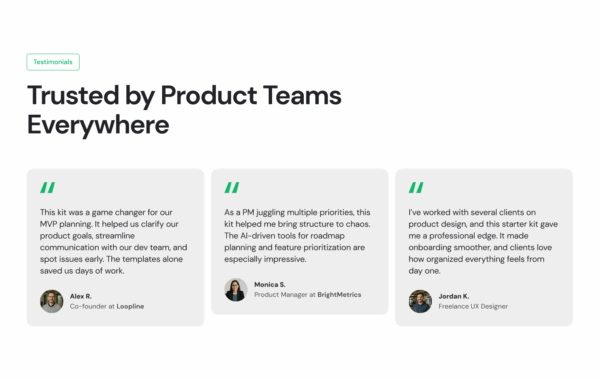
The Starter Kit has already become a go-to resource for product teams within Presta — and beyond.

What started as an internal tool evolved into a public, fully designed experience that continues to inspire new makers.
We’re proud of how accessible, scalable, and engaging the experience turned out — and even prouder that it’s already helping teams move faster and build better.

Enjoy our work
Have a sneak peek at some of our other projects and if you like what you see don’t be shy and get in touch! We would love to know more about you and your business.
Case Study: Trinigence
Case Study
Case Study: Square Nine
Case Study
View all recent cases→
Would you like free 30min consultation
about your project?

    © 2025 Presta. ALL RIGHTS RESERVED.
    • facebook
    • linkedin
    • instagram