17 February 2026
How to Rebuild Luxury Hotel Websites: A Process-Driven Hospitality UX Playbook Inspired by Square Nine
Read full Story
Spacing in UI Design: Best Practices for Clean Interfaces
One of the easiest ways to clean up a design is to give every element a little more room to breathe. When designing for the web, white space is almost always added to a design — if something looks a little too cramped, you add a bit of margin or padding until things look better.

One of the easiest ways to clean up a design is to give every element a little more room to breathe. When designing for the web, white space is almost always added to a design — if something looks a little too cramped, you add a bit of margin or padding until things look better.
The problem with this approach is that elements are only given the minimum amount of breathing room necessary to not look actively bad. To make something actually look great, you usually need more white space.
My approach is to start by giving something way too much space, then remove it until I am happy with the result.
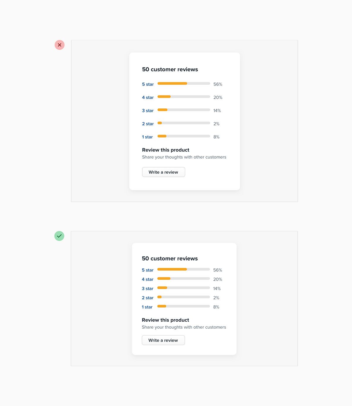
You might think I would end up with too much white space this way, but in practice, what might seem like “a little too much” when focused on an individual element ends up being closer to “just enough” in the context of a complete UI.
While interfaces with a lot of breathing room almost always feel cleaner and simpler, there are certainly situations where it makes sense for a design to be much more compact.
For example, if you’re designing some sort of dashboard where a lot of information needs to be visible at once, packing that information together so it all fits on one screen might be worth making the design feel more busy.
The important thing is to make this a deliberate decision instead of just being the default one. It’s a lot more obvious when you need to remove white space than it is when you need to add it.
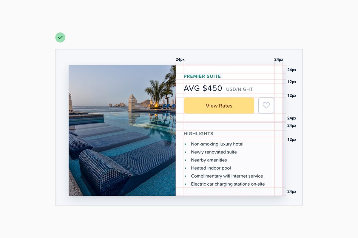
Spacing and sizing system
You shouldn’t be nitpicking when trying to decide on the perfect size for an element in your UI. Painfully trialing arbitrary values one pixel at a time will drastically slow you down at best, and create ugly, inconsistent designs at worst.
Instead, I always limit it to a constrained set of values that I defined in advance.

Just like you don’t want to toil over arbitrary values when sizing an element or fine-tuning the space between elements, you don’t want to build your spacing and sizing scale from arbitrary values either.
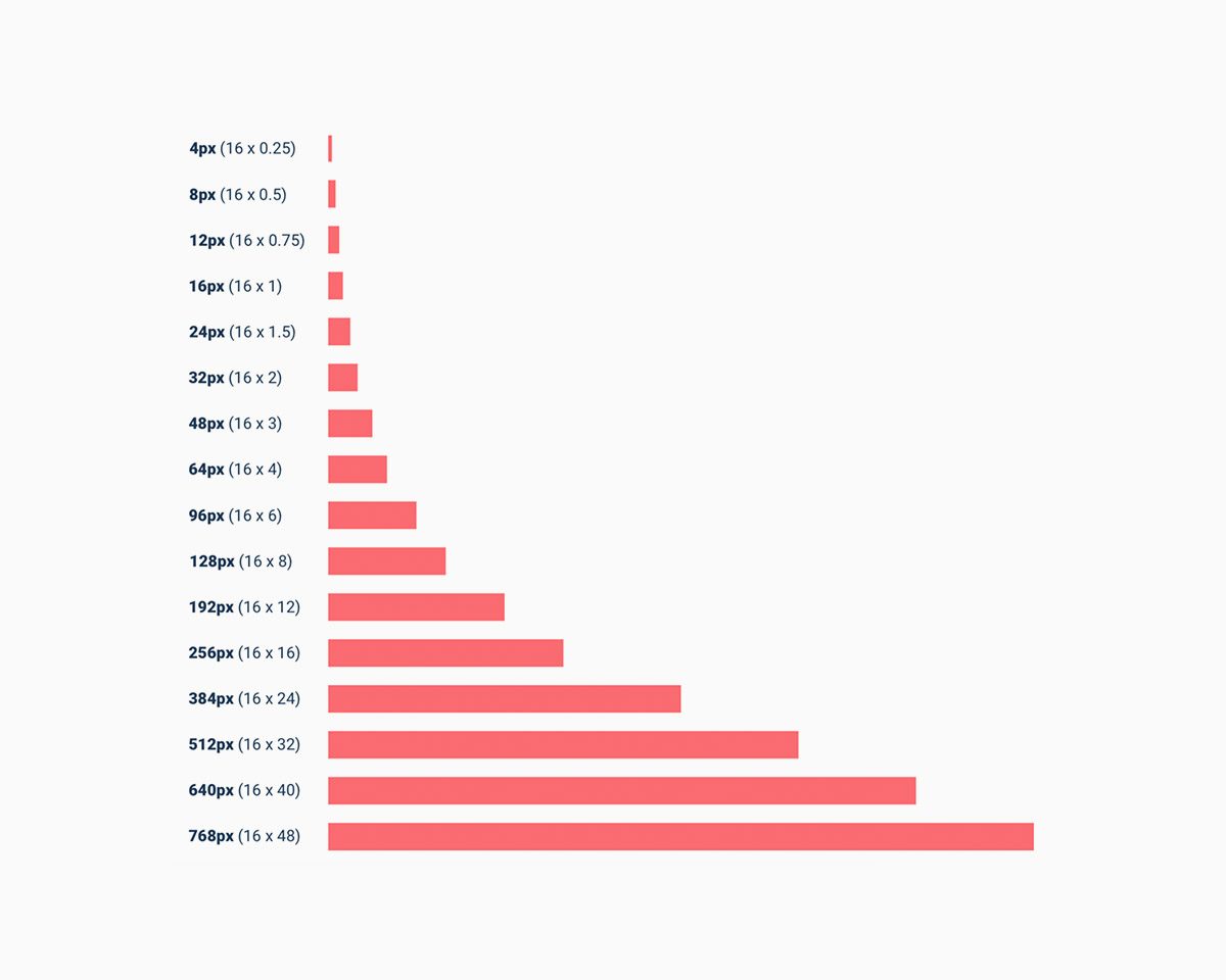
The simplest approach is to start with a sensible base value, then build a scale using factors and multiples of that value.
16px is a great number to start with because it divides nicely, and also happens to be the default font size in every major web browser.
The values at the small end of the scale should start pretty packed together, and get progressively more spaced apart as you get further up the scale.
Using the system
Once you’ve defined your spacing and sizing system, you’ll find that you’re able to design a hell of a lot faster. Need to add some space under an element? Grab a value from your scale and try it out. Not quite enough? The next value is probably perfect.
While the workflow improvements are probably the biggest benefit, you’ll also start to notice a subtle consistency in your designs that wasn’t there before, and things will look just a little bit cleaner.
A spacing and sizing system helps me create better designs, with less effort, in less time. Design advice doesn’t get much more valuable than that.