An Agency specializing in analyzing problems and proposing solutions in agriculture and rural development in Serbia. They are an experienced group of analysts who base their opinions and recommendations on research, years of experience and knowledge in the field. They worked relentlessly on creating a network of farmers and associates with whom they exchange informations and experiences every day.
 Case Study: Small Farm
Problem
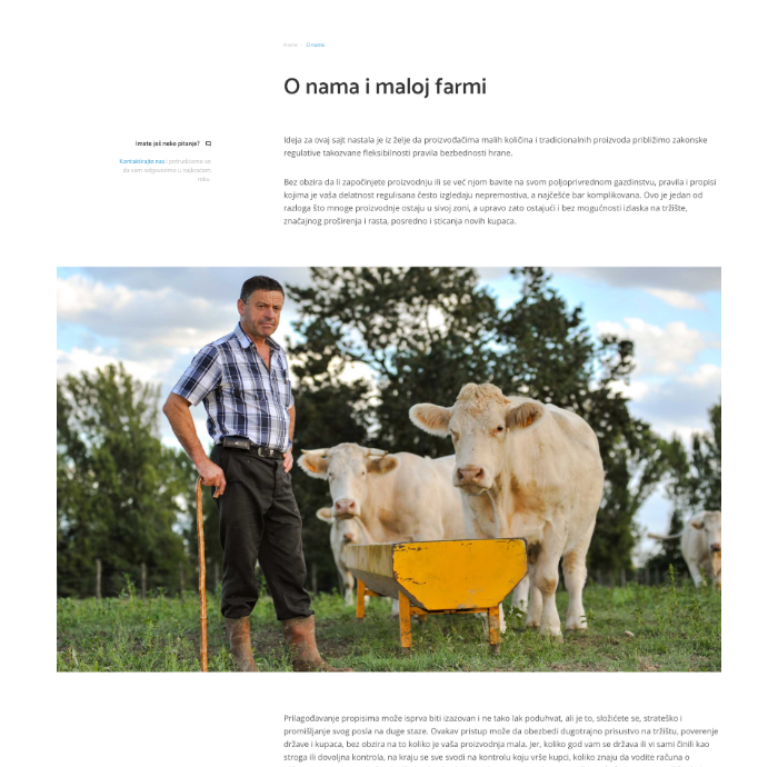
Extensive and complicated regulation make small farmers’ lives very complicated, which is why most of them have difficulties keeping their farms profitable and within the limits of the law. The challenge was to organize a large-scale database of documentation and make it easily accessible. We needed to figure out a way to direct a user to the correct informations with as few clicks as possible.
Solution
We made a quiz which consists of 4 key questions. Each question has only 2 or 3 answers available based on which we can identify and provide user with documentation and regulations that they need. With this approach we replaced a tiresome procedure of going through the ample documentation with four simple clicks.
Design process
The Design Process is an approach for breaking down a large project into manageable chunks. Architects, engineers, scientists, and other thinkers use the design process to solve a variety of problems. We use this process to define the steps needed to tackle each project.
- Define the problem
- Collect information
- Brainstorm & analyze
- Develop solutions
- Present ideas for feedback
- Improve design
User flow
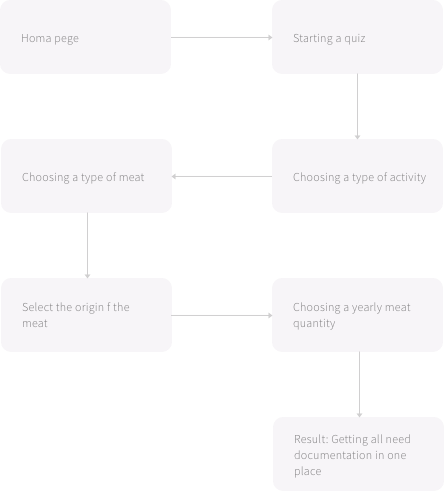
This is a part where we visualize interfaces. We start by writing down the starting position and the user goal and map them out to see how the flow goes. We also make some rough models, so that entire flow appears easily accessible to all users. Below is a user flow for the quiz.
Wireframes
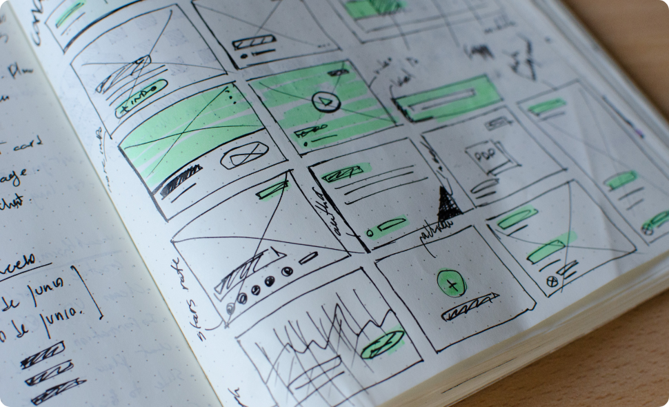
Wireframes help us visualize the skeleton form of the interface. With so many digital tools available, we still prefer doing it the old-school way – sketching it up. It gives us that abstract sense of satisfaction and happiness. We sketch several versions with a plain sharpie, discuss them with the client and then finalize the best version.
Creating new brand
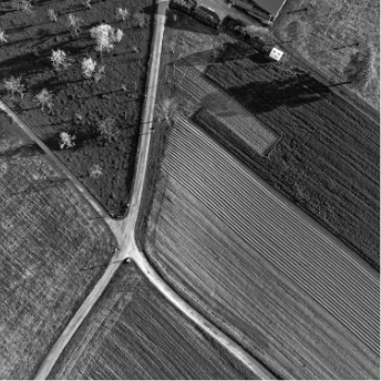
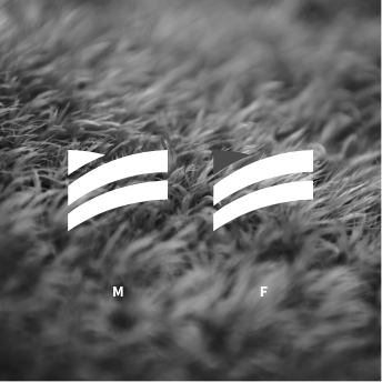
The request was to make a logo that leans more on the ‘administrative’ and less on the ‘farm’ side of the story. Our solution was to combine first letters (‘M’ and ‘F’) with stacked papers and farm fields and it was a winning combination. Cherry on the top is a beautiful gradient of a blue and bluish green.




Custom illustrations and icons
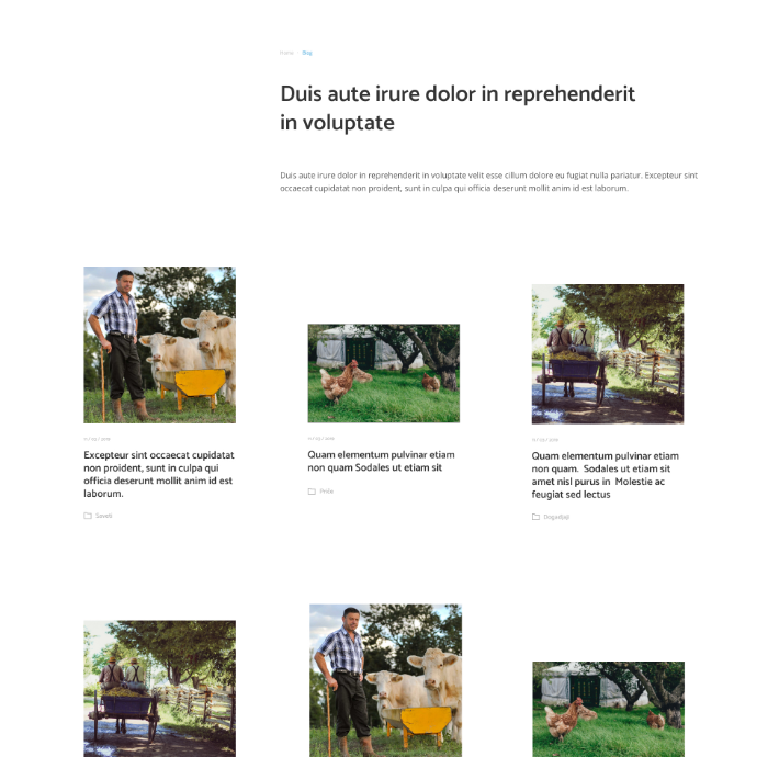
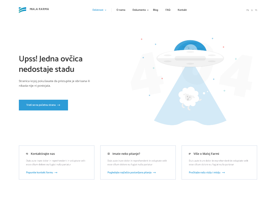
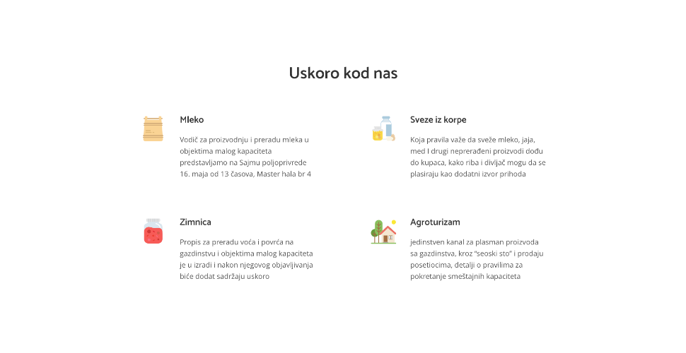
We created a set of mini-illustrations to be used troughout the website. It adds a recognizable character to the whole product.
We created a set of mini-illustrations to be used troughout the website. It adds a recognizable character to the whole product.
Design system
We follow the principle of atomic design when building design systems. Specifically because this approach performs well on the front-end as well.
We follow the principle of atomic design when building design systems. Specifically because this approach performs well on the front-end as well.
Information in few steps
With this approach we replaced a tiresome procedure of going through the ample documentation with four simple clicks
1. Select your activity
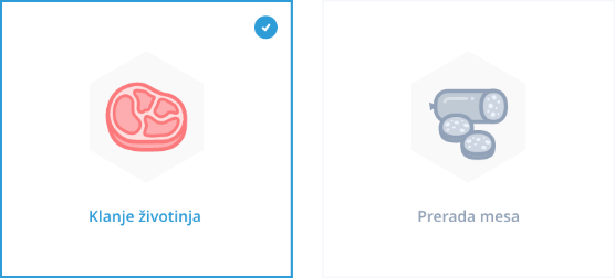
The first step in the quiz determines whether the user runs a butchery or a meat processing farm.

2. Choosing a type of meat
Since regulations are different for every type of the meat, next question lets users choose which meat are they processing/butchering.


3. Pick origin of the meat
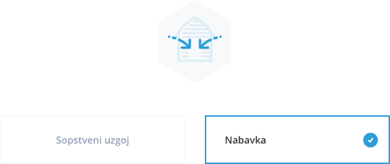
Another important aspect is the origin of the meat. Third question determines whether the meat comes from farmers estate or other sources.

4. Yearly meat quantity
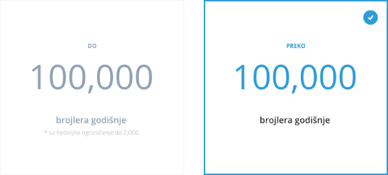
Quantity of the processed/butchered meat is another important aspect because it determines the production size and thus the applicable set of rules and regulations.
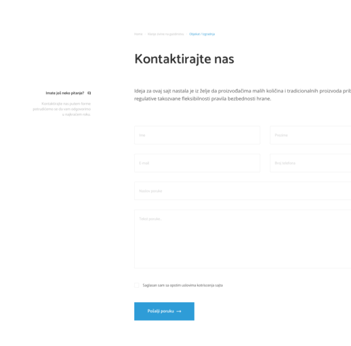
More pages and layouts
