About the client
FASPER is the Faculty of Special Education and Rehabilitation at the University of Belgrade, with more than 50 years of teaching, research and practice. It offers three accredited study programmes, Defectology, Speech and Language Therapy, and Special Education and Rehabilitation, at undergraduate, master’s and doctoral level.
The challenge
Important information, scattered everywhere.
Over the years, the website had grown around the faculty’s internal structure. Key information was spread across countless pages, study levels and programmes were hard to tell apart, and there was no clear hierarchy. Prospective students couldn’t find their way, current students relied on shortcuts, and the faculty team struggled to keep content up to date.
The solution
From the org chart to the student’s journey.
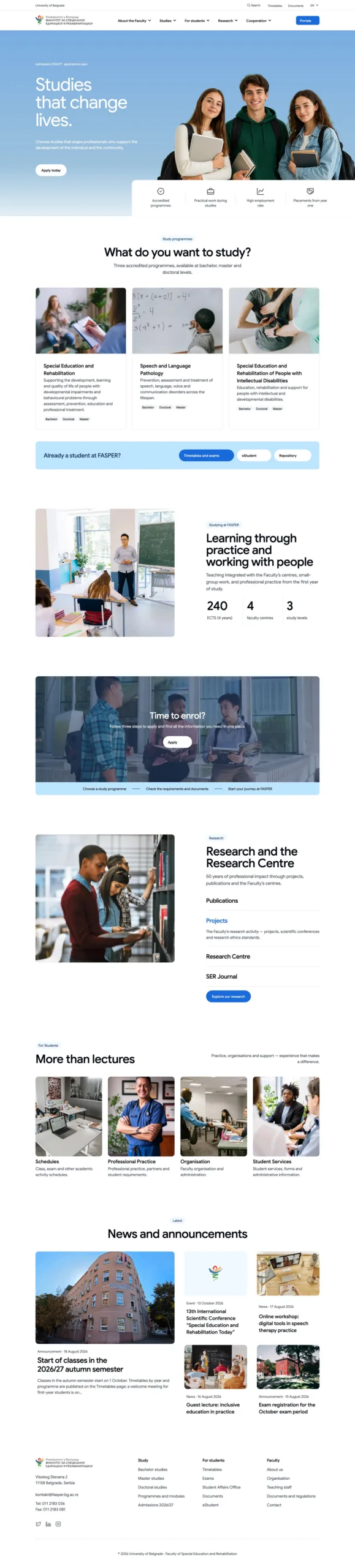
We rebuilt the information architecture around the questions people actually bring to the site: What can I study? How do I apply? What is studying here like? Clear entry points for studying, student life, current students, research and the faculty itself replace the institutional maze, and every study level and programme is now one click from the homepage.
Before & after
Same content, a structure people can follow.
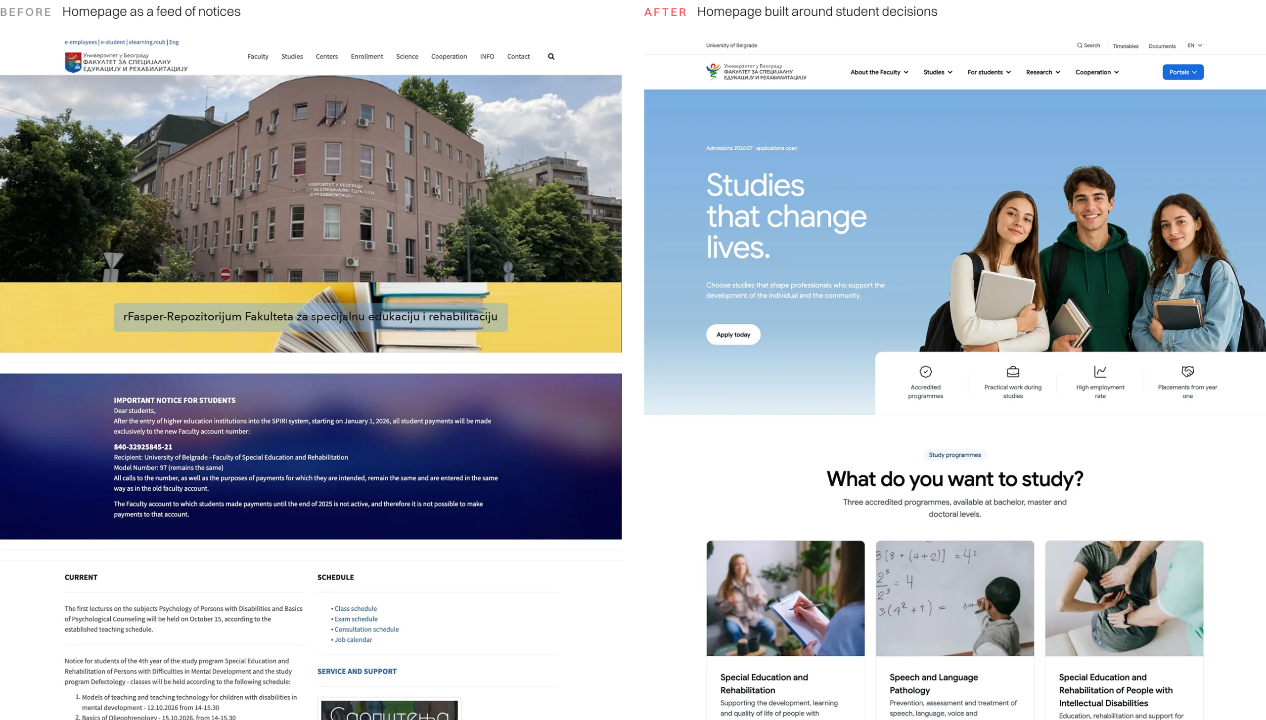
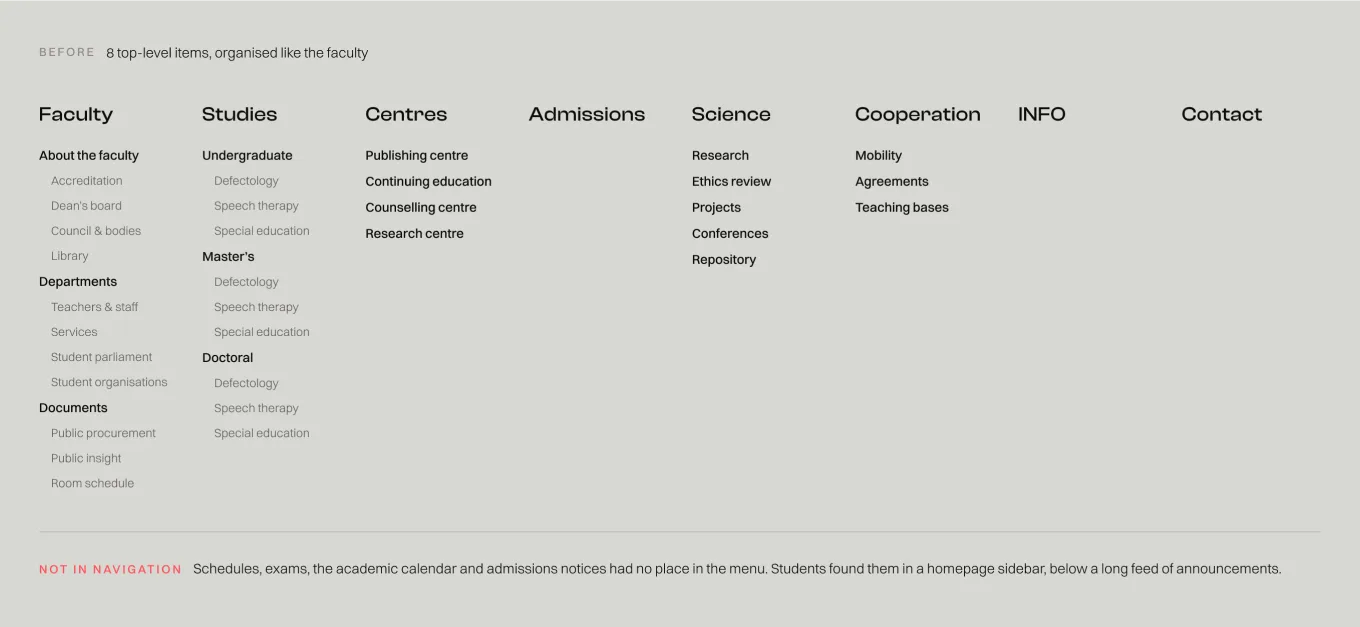
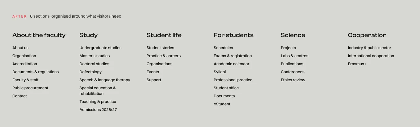
The old site mirrored how the faculty is organised. Departments, centres and governing bodies sat next to study programmes, while everyday student information lived in a long feed of notices on the homepage. The new structure starts from what visitors actually came to do.
What we did
01
UX research & content audit
Understanding who comes, and why.
We audited the existing site, mapped where key information actually lived and defined prospective students as the primary audience, alongside current students, staff and partners.
02
Information architecture
Two structures, one clear recommendation.
We explored two directions: refining the existing structure, and a user-centred model built around student decisions. We recommended the latter, with a phased rollout that balances quick wins and long-term clarity.
03
Navigation & content hierarchy
Every path visible at a glance.
Six main sections with structured mega menus put study levels, programmes, admissions and student services up front, while documents, procurement and other institutional content stay findable without getting in the way.
04
Templates & UI system
Built for the people who maintain it.
Reusable templates for programmes, study levels, staff profiles and documents give every type of content a fixed place, so the faculty team can update information without breaking the structure.
01
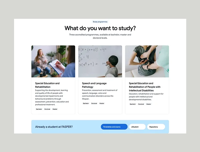
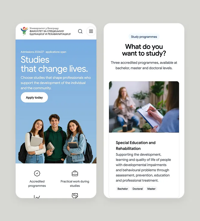
Built around the questions students ask.
What can I study? How do I apply? What is it like?
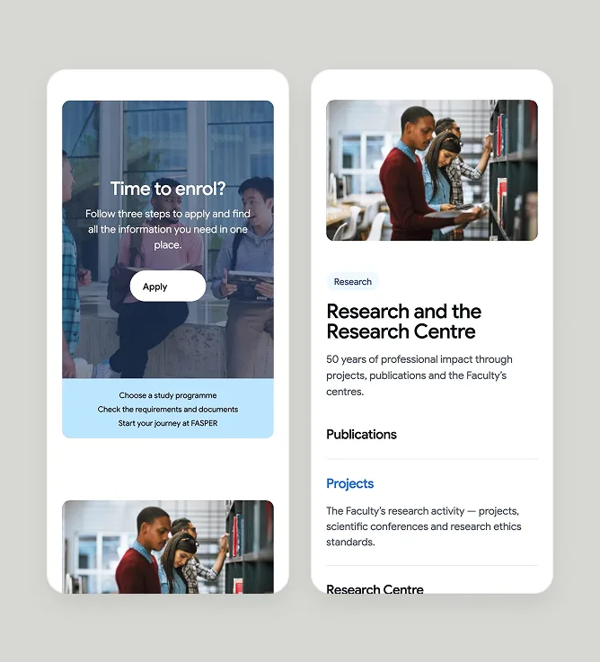
The homepage answers the questions prospective students arrive with, leading from study programmes and admissions to real student experience, with quick links for those who are already part of the faculty.
02
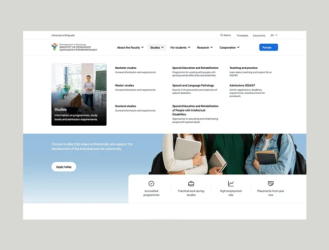
Every study path, one click away.
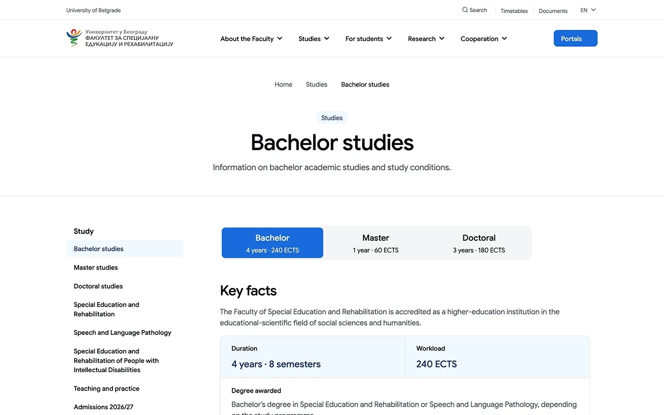
Undergraduate, master’s and doctoral studies, the three programmes, teaching and admissions sit together in one clear menu. Instead of digging through the site, students see all their options at once and go straight to the one they need.
03
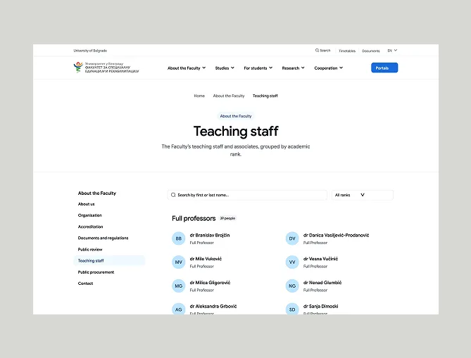
Easy to find, easy to update.
Documents, regulations and institutional information follow consistent templates with clear grouping. Visitors know where to look, and the faculty team knows exactly where every new piece of content belongs.
Outcome
Clarity, built into the structure.
results
A website that follows the student, not the org chart.
The new information architecture brings FASPER’s study programmes, admissions, student services, research and institutional content into one clear structure. Prospective students find their way from the first question to the application, current students reach everyday tools faster, and the faculty gets a site that is easier to maintain as it grows.