About
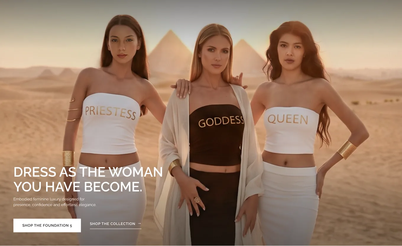
Light Priestess Temple is a fashion and lifestyle brand built around feminine identity and self-expression, combining elevated everyday pieces with a distinctive philosophy of dressing for the woman you are becoming.
The challenge
A brand built around identity, not just clothing.
Light Priestess Temple came with a rich brand world rooted in feminine identity, transformation and self-expression. The challenge was turning that philosophy into a shopping experience that felt distinctive without asking customers to decode the brand before discovering the clothes. The website needed to communicate the idea behind LPT while still behaving like an intuitive fashion store, with clear hierarchy, product discovery and a direct path to purchase.
The solution
From a big idea to a clear journey.
Rather than treating every brand message as equally important, we built the experience around a simple progression: introduce the world of LPT, establish its signature pieces and identities, then bring the customer naturally into the collection. This gave storytelling a clear role within the shopping journey instead of allowing it to compete with the products.
Approach
01
Brand positioning
Making an abstract concept immediately understandable. The brand’s language of transformation and feminine identity needed a visual expression that customers could understand before reading deeply into the philosophy.
02
Content hierarchy
Giving every message a purpose. Brand story, identities, signature pieces and products were organised into distinct layers, creating a clearer rhythm and keeping the experience focused.
03
Visual direction
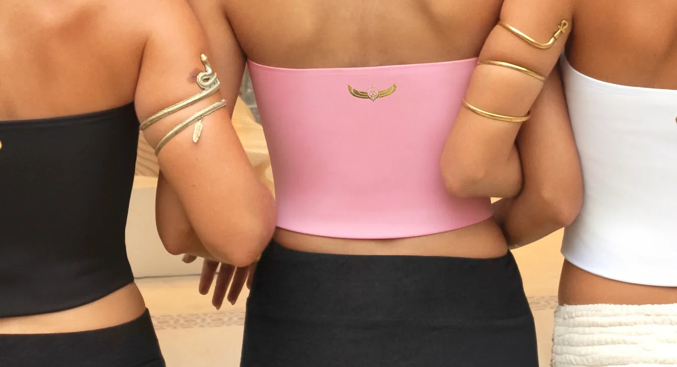
Finding the space between spiritual and fashion. The aesthetic needed to retain LPT’s softness and femininity while moving away from familiar wellness cues toward a more elevated, editorial fashion language.
04
E-commerce system
Building beyond the homepage. The visual language was designed as a reusable system that could carry naturally into collection and product pages without losing the character established by the brand experience.
01
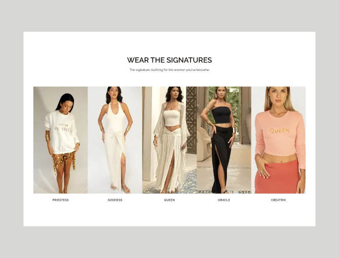
Designing around who she becomes.
Goddess. Queen. Priestess. Oracle. Creatrix. These identities are central to the LPT world, so we gave each a defined place within the experience. Editorial imagery and focused messaging connect them to the collection without taking attention away from the products.
02
Making spirituality feel like fashion.
LPT needed to feel feminine and spiritual without slipping into familiar wellness aesthetics. Generous whitespace, restrained typography, warm gold accents and confident imagery shift the brand toward a more elevated, editorial fashion language.
03
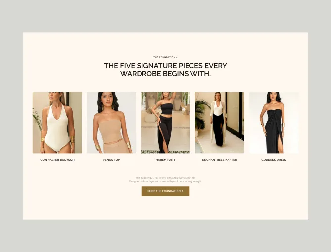
From brand experience to shopping experience.
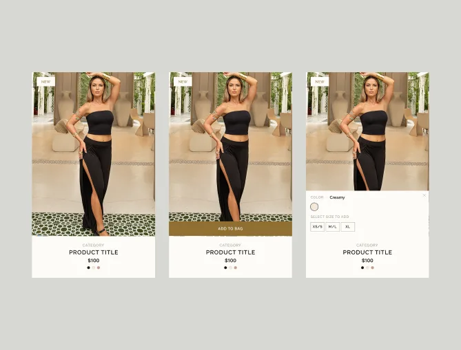
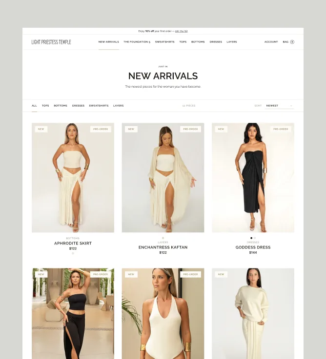
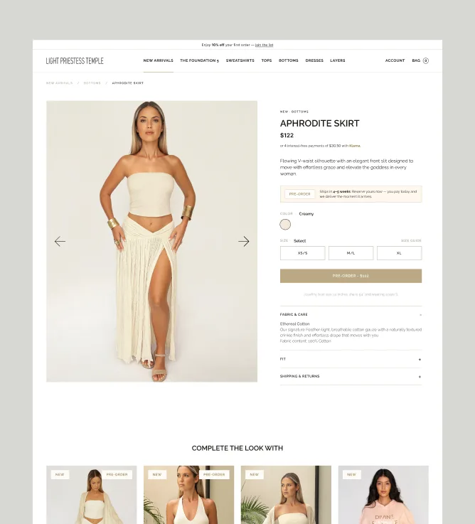
PLP and PDP templates deliberately shift the focus toward browsing, product information and decision-making, while carrying the visual language established on the homepage into the shopping experience.
Outcome
Identity, made shoppable.
Results
One cohesive brand and commerce system.
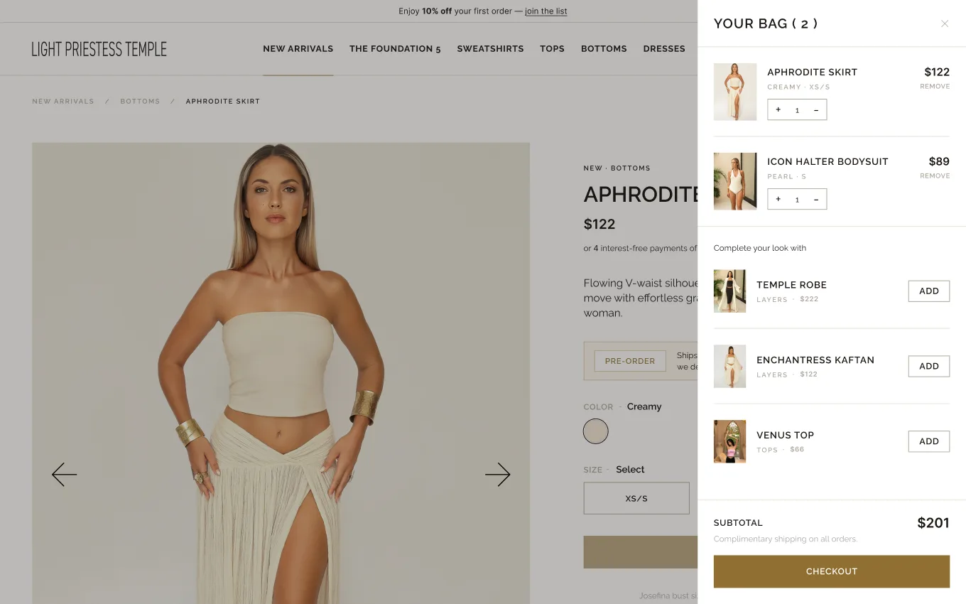
The final design brings LPT’s identity, editorial storytelling and product experience into one consistent system across the homepage, collection and product pages. A clear hierarchy gives the brand space to express its distinctive point of view, while keeping products easy to discover and the shopping journey intuitive. The result is a flexible foundation designed to evolve alongside new collections, campaigns and content.